Nedbank
Brand Custodianship
We gave Nedbank, one of Africa’s leading banks, an updated visual identity to match their forward-thinking services.
-
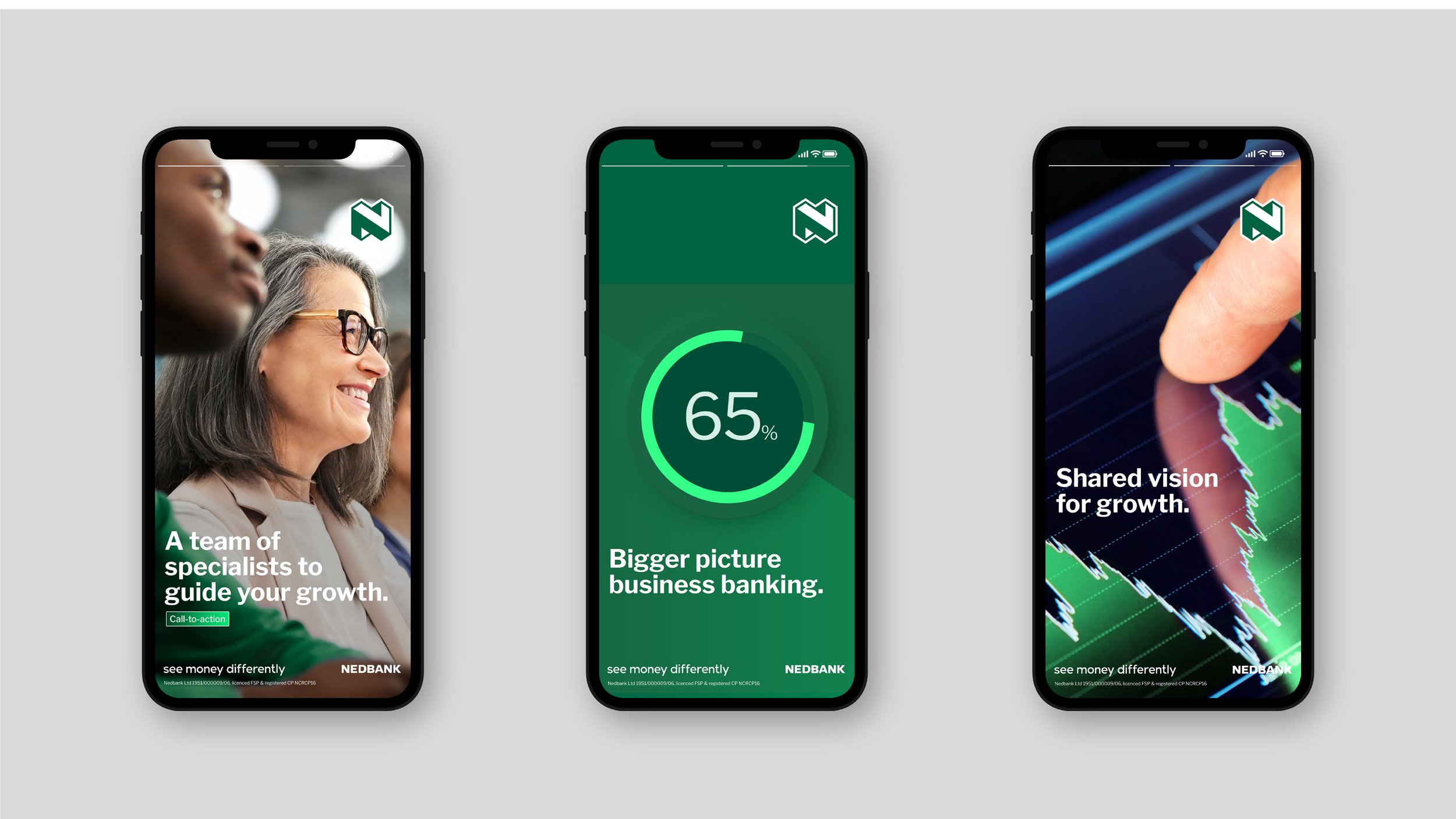
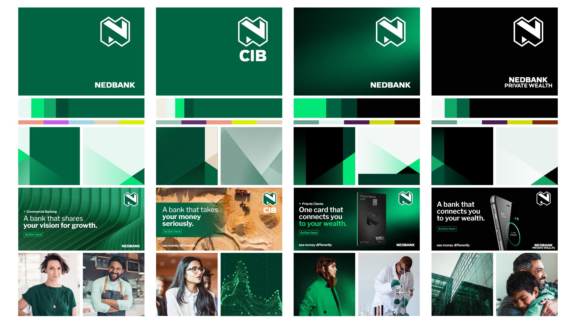
We created a dynamic design system inspired by the angles in their logo, then used these slanted shapes in all sorts of places, like backgrounds.
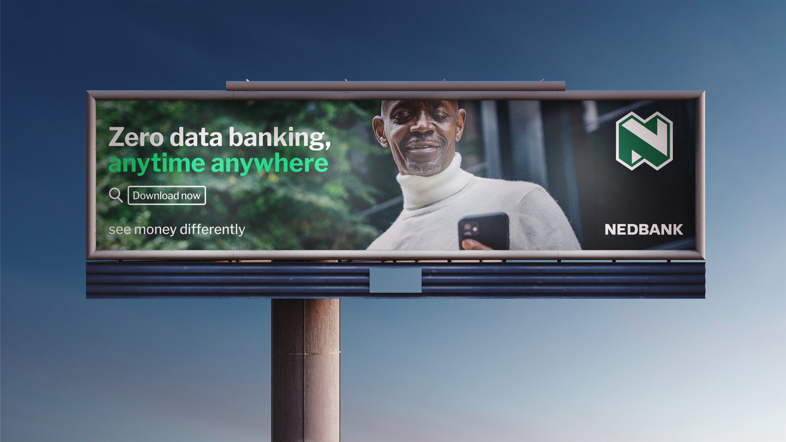
We kept their signature green as a base but added in some cooler, more accessible muted shades that contrast really well with classic black.
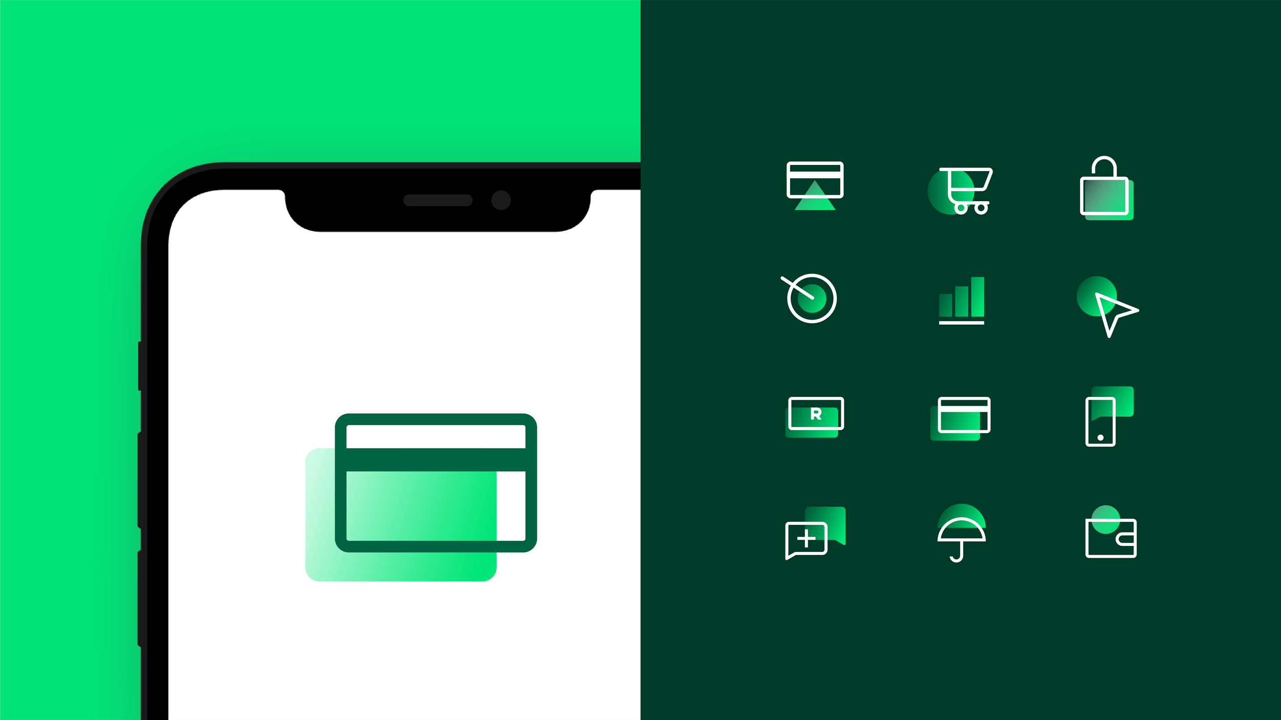
We also created a bunch of new icons that look more modern and convey more info, as well as a bank of youthful illustrations with some eye-catching movement. For their image library, we chose pictures that were warm but also grown-up.
To help users seamlessly navigate between the brand’s physical and digital worlds, we switched their typography to a Google Font. It's bolder, more legible, and also more accessible.
When looking at Nedbank’s cards, we analysed the competitor set and saw an opportunity to push the brand into a more ownable space. So we redesigned them all, from their Youth offering to Nedbank Private Wealth.
We wanted to make people really want the cards. We also needed each one to look different but still feel like part of a family. Inspired by modern minimalist fintech design trends, what we came up with looks slick and modern, and it works smoothly across physical and digital spaces.